Street Eye Candy: The Color Breaks Through in Public View
I spend time with gadgets in the wild, watching how people choose phones.
On the subway, people swap tips with their hands and pockets, not with words.
I notice Pixel fans and a few Samsung flip phones, yet iPhones still trend loud.
Most people here pick iPhones and Samsung models, even in crowded tunnels and cars.
The eye catch in the wild is the bright hue more than the brand name.
The iPhone 17 Pro in Cosmic Orange: A Kind of Showstopper
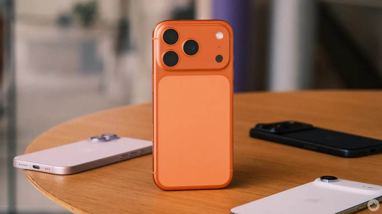
The new iPhone 17 Pro in Cosmic Orange is hard to miss.
Its vivid shade and bold camera bump grab eyes instantly.
This design shift changes how cases look, giving fans a fresh silhouette.
Even the other colors of the iPhone 17 Pro stand out next to older models.
That orange glow makes the back feel like a visual signature, not just a panel.
First Impressions: What the Orange Means in Real Life
From the moment I see the orange, I know the phone.
A quick pass by on a moving train proves the point.
The hue makes the device feel like a statement piece in public.
The camera bump is large and oddly shaped, a real talking point.
The frame uses a two-tone mix with a pale back, which is unusual.
Design Notes: The Look That Sparks Conversation
The Color plus the big camera bump creates a strong profile.
The metal edge looks dark beside the pale ceramic shield backing.
Some might love the odd mix, others may not.
Overall, the contrast makes the phone look unique, not dull.
That bold look is part of its charm and its public buzz.
What the Competition Might Do with Color
Rumors say Samsung could try a similar orange shade on the Galaxy S26.
Even with the same bright color, the iPhone’s rear design might keep it ahead.
Samsung tends to tweak the look yearly, often with a new coat of paint.
I wonder if orange will feel fresh in a few months, or vanish fast.
Color alone can shape how a phone is talked about in tech circles.
Other Flagships: Color as a Marketing Tool
The market has standouts like the Nothing Phone 3 and Pixel 9a.
There’s also talk of a lighter, thinner iPhone Air in the mix.
In Canada, these models keep the color race lively, with a mix of styles.
Still, the 17 Pro’s bold orange sets a strong mark, at least for now.
Color becomes the easiest way to tell one phone from another.
Street Buzz Meets Summit Hype
I don’t chase FOMO, yet I felt it at the Snapdragon Summit.
Many reviewers flashed the Cosmic Orange iPhone and looked impressed.
The color made me feel like I was missing a key moment.
That moment shows how much a hue can sway opinion in tech circles.
A bright shade can do what a long spec sheet cannot.
Why This Color Matters for the Next Year
A vivid color makes a phone easy to spot in a crowd.
It boosts brand memory when people show off the device in public.
If Apple follows with more color moves, the habit of mid-cycle updates could return.
A fresh tone can keep fans excited and draw new buyers toward a model.
In short, color can be a strong part of a phone’s story.
Hold On: What This Means for Future Devices
If color remains a top draw, we might see more playful hues across brands.
Design teams could test bold looks mid-cycle, not only at year’s end.
That kind of risk can pay off with real world chatter and sales.
Phones aren’t just tools; they’re style items that travel with people daily.
The orange iPhone 17 Pro gives the idea that style geeks and tech lovers can agree.
Please note that when you make a purchase through our links at GameHaunt, we might earn a small commission. This helps us keep bringing you the free journalism you love on our site! And don’t worry, our editorial content remains totally unbiased. If you’d like to show some support, you can do so here.


